- Neighbourhood
- >
- What's New
- >
- Re: Coming soon: The new-look eBill summary
What's New
Keep up-to-date with the latest news and features relating to your AGL online account and digital services.
- Subscribe to RSS Feed
- Mark Topic as New
- Mark Topic as Read
- Float this Topic for Current User
- Bookmark
- Subscribe
- Mute
- Printer Friendly Page
The new-look eBill summary
- Mark as New
- Bookmark
- Subscribe
- Mute
- Subscribe to RSS Feed
- Permalink
- Report abuse
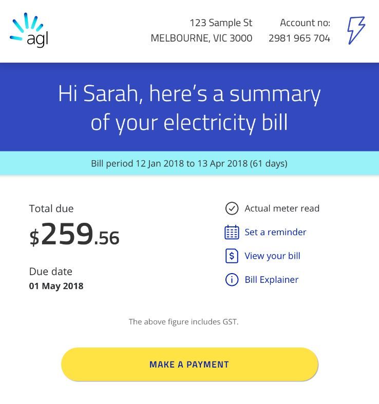
After listening to your feedback, we're excited to show you the new-look eBill summary. As well as freshening up the look and feel, we've added some crucial information so you can quickly get the important details about your account.
What's changed?
In addition to your bill amount, due date and other useful links, you'll now see:
- Whether your bill is an estimated or actual meter read (if you have a basic meter you can avoid an estimated bill by completing a self-service meter read)
- A link to set a bill due reminder in your calendar
- Instantly pay your bill with a link to make a payment
- A snapshot of any applied concessions or discounts
- A new usage and cost snapshot comparing your usage to the same period last year (if available).
- A link to our bill explainer page for more info on how to read your bill
How to view the full bill
While we've tried to include most useful information, you're still able to download your bill in full by selecting View your bill on your bill summary. You won't need to log in to your account to do so.
Alternately, you can access your bill by logging in to My Account.
To access your bill via the AGL app, select the Billing tab, tap the bill you'd like to view, then View PDF.
Questions and feedback
This new-look eBill was created based on feedback from customers like you, and we'd love to hear what you think. If you have any questions or comments, you're welcome to add them to this post!
- Tags:
- help_ebill
- Mark as New
- Bookmark
- Subscribe
- Mute
- Subscribe to RSS Feed
- Permalink
- Report abuse
Your new look billing is absolutely hopeless it lacks direction and when you click on some thing it goes to stuff that is totally unrelated you have excelled yourselves with stupidity who ever the rocket scientist was who dreamed up this load of rubbish should be sacked there was nothing wrong with the way it was congratulations AGL you have stuffed up big time it is typical of big business to create vague and confusing rubbish put it back the way it was simple and not confusing why do you people indulge in such wanky stupidity
Regards
Rod Muller
- Mark as New
- Bookmark
- Subscribe
- Mute
- Subscribe to RSS Feed
- Permalink
- Report abuse
I concur!
- Mark as New
- Bookmark
- Subscribe
- Mute
- Subscribe to RSS Feed
- Permalink
- Report abuse
- Mark as New
- Bookmark
- Subscribe
- Mute
- Subscribe to RSS Feed
- Permalink
- Report abuse
Hi,
For some reason I cannot pay my bill online Ref no. 58952250903553,
Thanks
- Mark as New
- Bookmark
- Subscribe
- Mute
- Subscribe to RSS Feed
- Permalink
- Report abuse
- Mark as New
- Bookmark
- Subscribe
- Mute
- Subscribe to RSS Feed
- Permalink
- Report abuse
In the new-look email the 'view your bill' link is very small. It should be very prominent on the page. Thanks.
- Mark as New
- Bookmark
- Subscribe
- Mute
- Subscribe to RSS Feed
- Permalink
- Report abuse
Modern approach.
- Mark as New
- Bookmark
- Subscribe
- Mute
- Subscribe to RSS Feed
- Permalink
- Report abuse
The Usage page on the website with the Electricity Bought From Grid | Solar Electricity Sold to Grid | Net Usage headings is much easier and more intuitive. It would be good to see the same translated on to the app.
The usage breakdowns over the Period (daily) and Day (hourly) are really easy to follow now.
I know this relates to the online view of my account, haven't had one of the summaries mentioned as yet. The summary looks very similar to the live overview page which is easy to understand. I like the cost to date feature.
- Mark as New
- Bookmark
- Subscribe
- Mute
- Subscribe to RSS Feed
- Permalink
- Report abuse
Your eBill is a great start, but you don't show the BPay Biller code or reference number anywhere. The link to download the full PDF should also be made more visible. Instead of just "View your Bill" change the link to something more meaningful like "Download your Bill" or "View PDF Bill".
- Mark as New
- Bookmark
- Subscribe
- Mute
- Subscribe to RSS Feed
- Permalink
- Report abuse
Your new bill system will not allow me to download my itemized bill or are you a new scam artist organization at work fleecing money from the unsuspected.? I might remind you that scamming is illegal in Australia. Pack your bags and go back to wherever you came from before the police catch up with you.
