- Neighbourhood
- >
- Energy
- >
- Managing Your Energy
- >
- Re: Electricity Usage and Solar Feed In
Managing Your Energy
Questions and discussions about managing your energy usage and saving money
- Subscribe to RSS Feed
- Mark Topic as New
- Mark Topic as Read
- Float this Topic for Current User
- Bookmark
- Subscribe
- Mute
- Printer Friendly Page
Electricity Usage and Solar Feed In
- Mark as New
- Bookmark
- Subscribe
- Mute
- Subscribe to RSS Feed
- Permalink
- Report abuse
I see there is a new Usage and Solar feed in display on you web site.
It's good that it doesn't kick-out to a different web site.
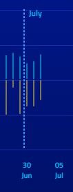
However, currently the new site lacks many of the features of the old one. In particular the ability to change the duration of the graph (i.e. to one week, one month, one year etc).
Showing the graph for billing period only just makes the individual data points too small.
When will the site get updated with that capability?
I was on the forum where we were asked about the features we would like in the new site. None of these have been implemented.
Other features I would like
- Change colour. The dark blue is not nice.
- Side by side comparison with an earlier period (especially year or quarter)
- BIll history (like the old site)
- Side by side histogram for export/import rather than the up-down style that is the default
- Mark as New
- Bookmark
- Subscribe
- Mute
- Subscribe to RSS Feed
- Permalink
- Report abuse
I read a reply somewhere here that they are working on an update and will be done in a few weeks. Agreed at the moment it is worse than the previous version.
A message on the screen about the upgrade would be nice.
I'm just a community member happy to share my knowledge.
To help with account and billing questions where you need to share sensitive information (i.e. your account and personal details), please contact AGL via chat or private message a moderator.
- Mark as New
- Bookmark
- Subscribe
- Mute
- Subscribe to RSS Feed
- Permalink
- Report abuse
It would also be nice if the graph also included the total power output from the panels. The downward grey bars could be extended in a different shade to show this.
I realise that would require cooperation with the inverter companies, but you'd think they could at least do it with companies they recommend (like Solis/Ginlong).
(I'm not fussed about the colours, as long as it is easy to read).
- Mark as New
- Bookmark
- Subscribe
- Mute
- Subscribe to RSS Feed
- Permalink
- Report abuse
Development on this is definitely ongoing, so stay tuned for improvements in the near future. If you have any specific feedback or suggestions you'd like to contribute toward improving features like this, the best place to do it is over on the Ideas section:
- Mark as New
- Bookmark
- Subscribe
- Mute
- Subscribe to RSS Feed
- Permalink
- Report abuse
