- Neighbourhood
- >
- Energy
- >
- Solar, Batteries & Electrification
- >
- Re: Monthly, seasonal and annual solar production ...
Solar, Batteries & Electrification
Questions and discussion about solar, batteries, and electrification
- Subscribe to RSS Feed
- Mark Topic as New
- Mark Topic as Read
- Float this Topic for Current User
- Bookmark
- Subscribe
- Mute
- Printer Friendly Page
Monthly, seasonal and annual solar production data for Adelaide
- Mark as New
- Bookmark
- Subscribe
- Mute
- Subscribe to RSS Feed
- Permalink
- Report abuse
Updated to 31 March 2020
I am a retired electrical engineer and have compiled a spreadsheet based on 6.36 years of solar power generation in the Adelaide area. We have 5.2 kW of panels on the roof, consisting of 20 REC 260 PE watt panels facing north at an angle of 27.5° above the horizontal, and with no shading.
For the period from 17/11/2013 to 21/05/2017, I have used the daily solar energy production data from our original solar SMA 5000TL-21 inverter, downloaded via Bluetooth. This inverter had an absolute maximum power output of 5.0 kW.
For the period from 26/05/2017 to 31/10/18, I have used the csv daily solar energy production data in AGL’s Solar Command from our Sunverge VPP DC coupled battery system. This inverter had an absolute maximum power output of 4.7 kW.
Since 01/11/18, I have used the csv daily solar energy production data from our Fronius Primo inverter from solar.web. This inverter has an absolute maximum power output of 5.0 kW.
It is important to understand that the power rating given by the manufacturers of solar panels will be an idealised number, and that the real power will be less than stated. Also, the power output of solar panels typically decreases by between 0.4% and 0.5% for every degree centigrade rise in temperature above 25° C, so cool bright days are the best. Roof mounted panels parallel to the roof can be expected to be 35 C° above the ambient temperature, so on a 40° C day in Adelaide, the panel temperature could be 75° C. This is 50 C° above the test temperature of 25°C, leading to a decrease in power output of 20% to 25%. Output also decreases as the panels age with time, albeit measured in decades for quality panels.
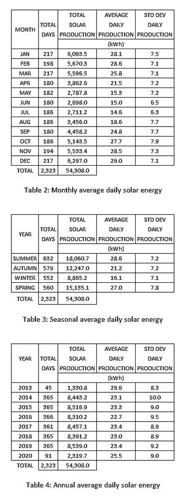
I have averaged the daily energy produced on a monthly, seasonal and annual basis, and have also included standard deviations. Standard deviation is a measure of the spread of a set of numbers around the average of that set. This gives an indication of how scattered the values are and how repeatable the values might be over time, in that the smaller the standard deviation, the more the values cluster around the average. As a rough guide, 68% of the daily production numbers will fall within one standard deviation of the average, and 95% will fall within two standard deviations of the average. As an example, January has a daily average of 28.1 kWh over the 217 total January days studied, with a standard deviation of 7.5. This means approximately that 68% of all the January values will fall between 20.6 and 35.6 kWh, and 95% of all the January values will fall between 13.0 and 43.1 kWh.
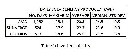
The solar energy production numbers in this document have all been generated from the one set of solar panels, but from three different inverter systems. Given that the energy generated is dependent on both the panels and the power conversion efficiency and maximum output of the inverter, I have summarised the statistics of all three inverters in Table 1 to show the consistency of the inverters.
As an aside, these numbers are now sufficiently large to suggest the Fronius Primo inverter is more efficient than both the Sunverge and the SMA inverter. The average daily production for the Fronius Primo is 9.8% higher than the Sunverge and 6.4% higher than the SMA, even though the Fronius maximum is significantly lower than the other two. The median for the Fronius Primo is also significantly higher than the other two, and the consistent standard deviations imply radiation consistency over the three different time periods.
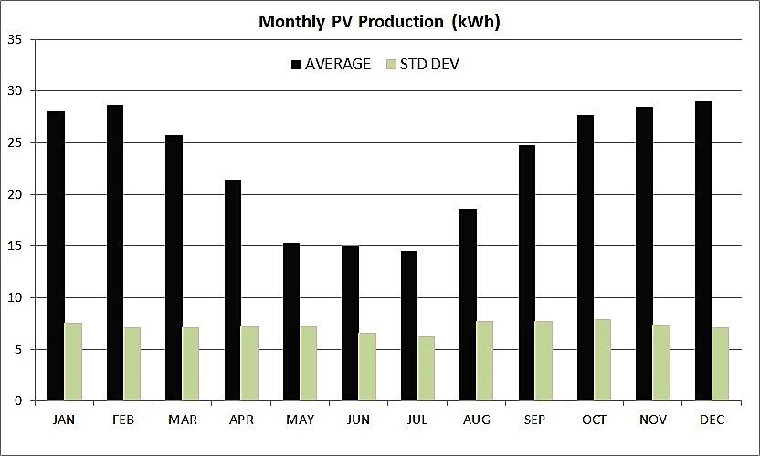
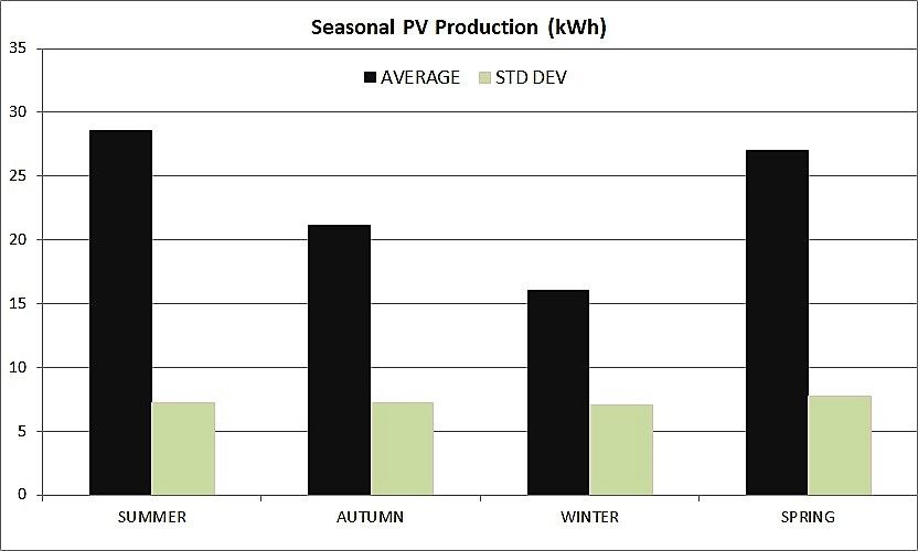
The following tables and histograms summarise the data over the different intervals.
SUMMER: December, January and February.
AUTUMN: March, April and May.
WINTER: June, July and August.
SPRING: September, October and November.
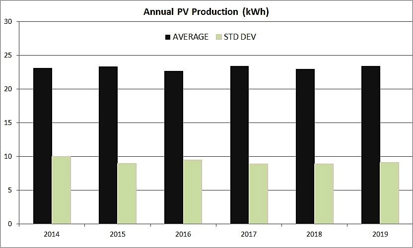
The annual data histogram above shows only complete calendar years, and the general consistency of the annual data suggests that those wishing to predict their own future energy production in Adelaide from this data could do so fairly reliably.
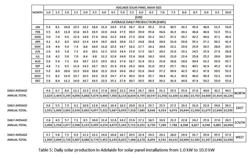
To facilitate your own calculation, Table 5 shows the estimated daily production figures for each month of the year, plus the estimated total annual output, based on solar panel installations from 1 to 10 kW, with summaries for north, east, south and west facing panels.
The most common roof pitches in Australia are flat, 15° and 22.5°. My north facing roof pitch is 22.5°, but the panels have been raised slightly to have a pitch of 27.5°. If your panels are not at a pitch of 27.5°, or not facing north, east, south or west, you may need to make some adjustments to my data. The optimum pitch angle above the horizontal for solar panels is the latitude, which is 34.9° here in Adelaide. There are many articles on the web, such as solar panel orientation and solar panel angle, which discuss corrections for angle of pitch and direction.
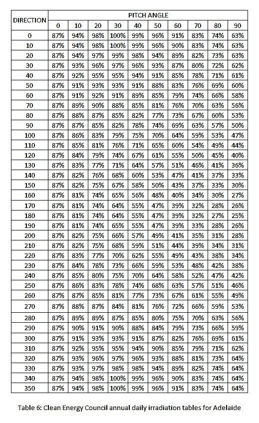
Table 6 below is from the Clean Energy Council guidelines for direction and panel angle and details the effect of pitch and direction on annual daily irradiation on an inclined plane expressed as a percentage of the maximum value, where north facing (0 degrees direction) at a pitch of 30 degrees is the maximum for Adelaide.
Please see my Profile if you’d like to learn more about other articles I have written on solar energy and my participation in AGL’s Virtual Power Plant solar battery storage program.
- Mark as New
- Bookmark
- Subscribe
- Mute
- Subscribe to RSS Feed
- Permalink
- Report abuse
- Mark as New
- Bookmark
- Subscribe
- Mute
- Subscribe to RSS Feed
- Permalink
- Report abuse
Hi Kim
I have generated data for all capital cities by adjusting empirical Adelaide data using BOM radiation and temperature data for those cities. I had given up publishing on the Community because there doesn’t seem to be any interest in serious engineering analyses. If you are interested I could reconsider that later this year.
Cheers,
Richard
- Mark as New
- Bookmark
- Subscribe
- Mute
- Subscribe to RSS Feed
- Permalink
- Report abuse
- Mark as New
- Bookmark
- Subscribe
- Mute
- Subscribe to RSS Feed
- Permalink
- Report abuse
Hi,
I had developed numbers for all capital cities, based on my Adelaide observations, but decided not to publish because I didn't think there would be much interest to warrant the effort.
I will include Newcastle and send you those shortly.
I've taken the BOM solar radiation monthly averages and the BOM average maximum monthly temperatures, and scaled my Adelaide data based on those numbers. Temperature is important because of the negative temperature coefficient of solar panels of about -0.5% per centigrade degree.
cheers,
richard
- Mark as New
- Bookmark
- Subscribe
- Mute
- Subscribe to RSS Feed
- Permalink
- Report abuse
Hi Kim,
I've finally got around to expanding my radiation data, as you can now see. in Solar Production Data For Adelaide And Other Cities
I've also included Newcastle in case that helps.
Cheers,
Richard
