- Neighbourhood
- >
- Energy
- >
- Managing Your Energy
- >
- Re: Merging AGL and Solis/Ginlong solar data
Managing Your Energy
Questions and discussions about managing your energy usage and saving money
- Subscribe to RSS Feed
- Mark Topic as New
- Mark Topic as Read
- Float this Topic for Current User
- Bookmark
- Subscribe
- Mute
- Printer Friendly Page
Merging AGL and Solis/Ginlong solar data
- Mark as New
- Bookmark
- Subscribe
- Mute
- Subscribe to RSS Feed
- Permalink
- Report abuse
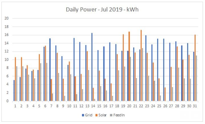
Downloading spreadsheets from https://myaccount.agl.com.au/usage and https://m.ginlong.com ("Devices" tab, then click on your inverter), I have been able to produce graphs like this:
Where:
Grid = power I'm taking from the grid.
Solar = total power generated by my solar panels.
FeedIn = power fed back into the grid (from my panels)
Looking at the difference between "Solar" and "FeedIn", I can see our daily self-consumption.
I experimented with a few different ways to combine the data, but (so far anyway) I find this the most useful. If anyone can think of other useful ways to graph the data, I'd be interested to hear about it.
Solved Go to Answer
- Mark as New
- Bookmark
- Subscribe
- Mute
- Subscribe to RSS Feed
- Permalink
- Report abuse
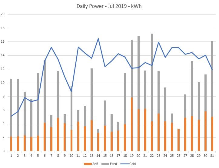
Playing around with Excel, I think a Combo Chart (using a Line and Stacked Columns) is the most useful way to view the data (for me anyway).
- Mark as New
- Bookmark
- Subscribe
- Mute
- Subscribe to RSS Feed
- Permalink
- Report abuse
I might suggest you compare the daylight hours drawn from the grid verses your FIT and Solar Inverter reports to see how much solar is offsetting your daylight consumption. You can also look at your solar panel system efficiency by taking the total kW divided by your peak kW. This should be above 50%.
If I’ve helped in anyway, please mark my post as SOLVED!
This helps our Community know the answer to common questions.
- Mark as New
- Bookmark
- Subscribe
- Mute
- Subscribe to RSS Feed
- Permalink
- Report abuse
Thanks for the suggestion.
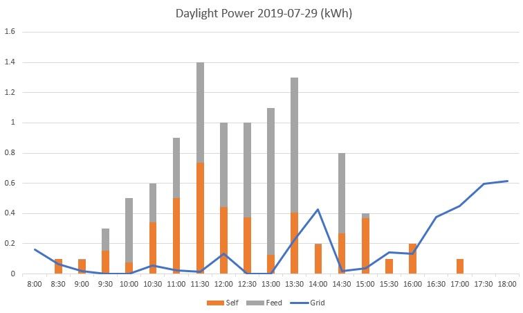
I started with whole day summaries because that was easier. The "Day" data (i.e breakdown every 5 mins) from Ginlong is a bit intimidating, but I was thinking of producing similar graphs for daylight hours with data points every 30 mins (to match up with the AGL data).
I'll do that once I figure out what all these columns mean (or, at least, the ones that are useful):
Time
InverterSN
Data LoggerSN
Alert Details
Alert Code
DC Voltage PV1(V)
DC Voltage PV2(V)
DC Voltage PV3(V)
DC Voltage PV4(V)
DC Current1(A)
DC Current2(A)
DC Current3(A)
DC Current4(A)
Total DC Input Power(W)
AC Voltage R/U/A(V)
AC Voltage S/V/B(V)
AC Voltage T/W/C(V)
AC Current R/U/A(A)
AC Current S/V/B(A)
AC Current T/W/C(A)
AC Output Total Power (Active)(W)
AC Output Frequency R(Hz)
Generation of Last Month (Active)(kWh)
Daily Generation (Active)(kWh)
Total Generation (Active)(kWh)
Power Grid Total Apparent Power(VA)
Meter AC voltage A(V)
Meter AC current A(A)
Meter AC voltage B(V)
Meter AC current B(A)
Meter AC voltage C(V)
Meter AC current C(A)
Meter active power A(W)
Meter active power B(W)
Meter active power C(W)
Meter total active power (W)
Meter reactive power A(Var)
Meter reactive power B(Var)
Meter reactive power C(Var)
Meter total reactive power (Var)
Meter apparent power A(VA)
Meter apparent power B(VA)
Meter apparent power C(VA)
Meter total apparent power (VA)
Meter power factor
Meter grid frequency(Hz)
Meter positive total active power(kWh)
Meter reverse total active power(kWh)
Inverter Temperature(℃)
Inverter Status
Generation Yesterday(kWh)
System Time
- Mark as New
- Bookmark
- Subscribe
- Mute
- Subscribe to RSS Feed
- Permalink
- Report abuse
Hi Bob,
The important columns would be:
Time
Generation of Last Month (Active)(kWh)
Daily Generation (Active)(kWh)
Total Generation (Active)(kWh)
AC Output Total Power (Active)(W)
System Time
As far as time, it depends on whether it is the date/time format from the TIME column or the System Time column.
Take the end of day Total Generation and subtract the start of day Total Generation and that will tell you how much kWh generated for that day. Look at the Feed-in-Tariff on your detailed spreadsheet for that day and the power drawn for the grid for that day. That tells you how much solar power consumption was used up by your house. That's the important information.
Solar Power Financial Benefit ($) = [Consumed x Peak] + [FIT x FiT Rate] (You can get the Peak and FiT Rate from your AGL bill and plug it in) - This will tell give you an idea of how long until your Solar Panel installation pays for itself.
Sollar Panel Efficiency (%) = Avg. Peak Pac(W) / Total Kw [Panels]
So, this formula is important for knowing if your Solar panels are working as expected. It should not go below 50%. If it does, something is wrong, either it is not all wired in or you have way too much shading. So you take the total Kw (note I said Kw, not kWh) and divide it by the highest peak Pac(W). On your report, I think this may be the column "AC Output Total Power (Active)(W)". I'm not 100% sure, but you need to look at the values and see if it makes sense across the datalogger report.
The above two formula(s) are truly what you need to track and you can also do some type of graphical representation of the same. As for your electricity consumption, you should take the sum of all the daylight hours and see what the kWh is consumed during daylight hours. If you are still drawing from the grid during these hours AND your Feed-In-Tariff is zero, then it means a power source at home is drawing more than your Solar can cover. That's also worth tracking on a graph as well.
Hope the above is helpful.
Regards,
Sri
If I’ve helped in anyway, please mark my post as SOLVED!
This helps our Community know the answer to common questions.
- Mark as New
- Bookmark
- Subscribe
- Mute
- Subscribe to RSS Feed
- Permalink
- Report abuse
Thanks for that.
At this stage, I'm mostly interested in the kWh produced in each 5 (or so) min block. (I've only had the panels for a few months). So "Daily Generation (Active)(kWh)" is the one to use, I gather. It seems to be the power generated from the beginning of the day to the time given in that row. I can use it to see what is generated over each 30 min block and compare it with the AGL data. It won't be really precise, because the AGL 30 min blocks always start on the hour or half-hour, whereas the Ginlong data may be a minute or two off.
As for "Time" and "System Time", besides using different formats, "System Time" seems to give a time 1h52m earlier than "Time". Looking at what is generated, "Time" seems to be the one to go with. (I have no idea what "System Time" would be).
(It is a bit annoying that the Ginlong data is all text and you have to use the Excel NUMBERVALUE function or "Text to columns" to convert it).
- Mark as New
- Bookmark
- Subscribe
- Mute
- Subscribe to RSS Feed
- Permalink
- Report abuse
- Mark as New
- Bookmark
- Subscribe
- Mute
- Subscribe to RSS Feed
- Permalink
- Report abuse
- Mark as New
- Bookmark
- Subscribe
- Mute
- Subscribe to RSS Feed
- Permalink
- Report abuse
- Mark as New
- Bookmark
- Subscribe
- Mute
- Subscribe to RSS Feed
- Permalink
- Report abuse
Hi Bob,
I agree. It would make sense over monthly and then compare over the course of a year.
I may have missed conveying my original point when I responded and that is, your graph was mainly catered around the Grid, Solar, and FeedIn. So if you were wanting to simply convert the detailed Inverter report and Energy Retailer detail to a graph, this is a good process/method.
My suggestion was around graphing the value-added analysis which underpins the detailed information:
A) Solar Financial Benefit (By Month) - [Consumed x Peak Rate] + [FiT x FiT Rate]
B) Solar Panel Efficiency (By Month) - Average Peak Pac(W) / Total Kw of your Panels
For (A), you need Solar Power Consumed and FeedIn information only.
For (B), you need the Solar details from your Inverter.
(A) and (B) are good for understanding if you are getting value for money for your solar panel installation.
The original graph you mentioned is good for graphically representing the detailed data which comes from the inverter and the energy retailer.
If one didn't have solar, then I'd be saying it would be good to know how much power is used during Peak, Shoulder, and Off-Peak (If Time-Of-Use) over each day, month, or year, etc.
The Bill summarises this, but if the user of the Grid had an understanding of how they were using power and at which times, they could also amend their behaviour of using heavy consumption appliances during shoulder or off-peak (if possible).
Here's an example of summary data in a table (which I think should be graphed - sorry if it is too small):
If I’ve helped in anyway, please mark my post as SOLVED!
This helps our Community know the answer to common questions.
-
- 1
- 2


