- Neighbourhood
- >
- Energy
- >
- Energy - General
- >
- Please explain the calculation for monthly average...
Energy - General
All general questions and discussion related to energy
- Subscribe to RSS Feed
- Mark Topic as New
- Mark Topic as Read
- Float this Topic for Current User
- Bookmark
- Subscribe
- Mute
- Printer Friendly Page
Please explain the calculation for monthly average (we have 12 months a year as far as I know)
- Mark as New
- Bookmark
- Subscribe
- Mute
- Subscribe to RSS Feed
- Permalink
- Report abuse
- Mark as New
- Bookmark
- Subscribe
- Mute
- Subscribe to RSS Feed
- Permalink
- Report abuse
- Mark as New
- Bookmark
- Subscribe
- Mute
- Subscribe to RSS Feed
- Permalink
- Report abuse
- Mark as New
- Bookmark
- Subscribe
- Mute
- Subscribe to RSS Feed
- Permalink
- Report abuse
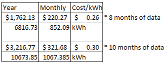
The answer is very simple, the top figure is for 8 months
Bottom figure is for 10 months
Why don't you show the figures for 2021 and 2023.
2021 will not be available and 2023 will only be for 7 months....
AND you don't have smart meters.
SERIOUSLY
If this comment solves your issue please solve the post, if you like this comment please take the opportunity to click the Like button below.
- Mark as New
- Bookmark
- Subscribe
- Mute
- Subscribe to RSS Feed
- Permalink
- Report abuse
- Mark as New
- Bookmark
- Subscribe
- Mute
- Subscribe to RSS Feed
- Permalink
- Report abuse
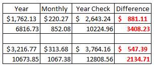
Here are the facts as I see them.
Assuming the Year data is correct.
If I multiply the YEAR DATA by THE MONTHLY DATA I should get the same figure
BUT I DON'T THE DIFFERENCE IS SHOWN IN RED
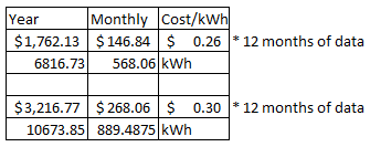
So I have added my workings to show how the figures are calculated.
The ANSWER IS YOU DID NOT HAVE THE RESULTS FOR A FULL YEAR
I did PM you and ask for you to show figures from other years and your reply was "ARE YOU AN AGL EMPLOYEE".
I replied and stated that I am not and NEVER indicated that I was.
AGL employees are clearly indicated by an _AGL after their name and have a AGL ICON
UPDATED REPLY to show workings from spreadsheet
Actual data divided by 12 months so your graph has no correct figures on it.
So doing some maths Year / Monthly for both $ value and kWh, I get top meter to be 8 months and bottom meter to be 10 months.
Data as shown with monthly usage.
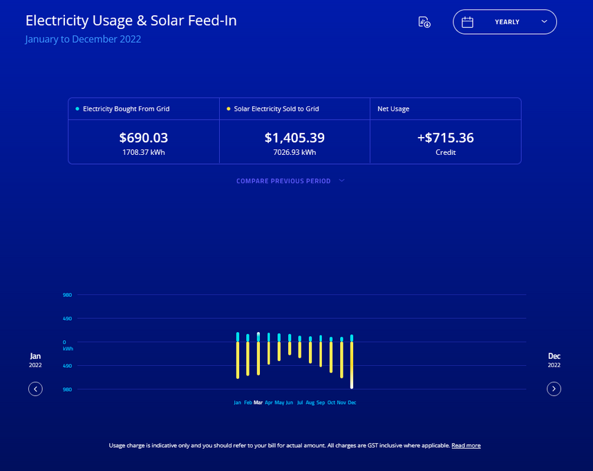
My smart meter view shows individual views for months, which in fact I can drill into and see the daily total usage, then I can drill into that to get the hourly usage (which in not correctly timed).
Show the year prior and this current year.
I will show you what I see with my SMART METER DATA

SERIOUSLY!!!
If this comment solves your issue please solve the post, if you like this comment please take the opportunity to click the Like button below.


