- Neighbourhood
- >
- Website & App
- >
- AGL App
- >
- Improve terrible daily/hourly use data display
AGL App
Questions, discussions and feedback on the AGL mobile app
- Subscribe to RSS Feed
- Mark Topic as New
- Mark Topic as Read
- Float this Topic for Current User
- Bookmark
- Subscribe
- Mute
- Printer Friendly Page
Improve terrible daily/hourly use data display
- Mark as New
- Bookmark
- Subscribe
- Mute
- Subscribe to RSS Feed
- Permalink
- Report abuse
Data display on the app is terrible.
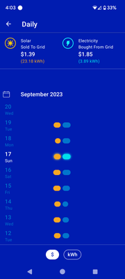
The display to look at each day scrolls down along the page. An entire week or month can't be viewed.
I have no idea what sets the width of the x axis as all my data are bunched in the middle so I can't see day to day variation. There are no labels, axis marks or gridlines to see the range of the axis. See below.
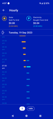
Additionally, when clicking on each day the display looks the same. There is no way to see the whole day on one page; one must scroll up and down and look at part of the day (about 5 hours).
Same issue with an arbitrarily selected graph range for the x axis and no labels to indicate the range.
See below
This is far worse than what is available with the apps provided by solar companies, other energy companies (e.g. origin).
- Mark as New
- Bookmark
- Subscribe
- Mute
- Subscribe to RSS Feed
- Permalink
- Report abuse
Hello @NatAttack, Thank you for taking the time to provide this feedback.
Please be assured your feedback has been formally lodged. We take service seriously, and our customer feedback is regularly reviewed by Management to improve the products and services we provide.
Kind Regards,
Natalie

