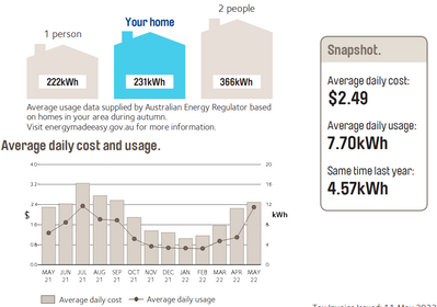
Daily usage charts

ret
Switched-on
1 Reply 23793 Views

I always tend to take a quick look at the energy and cost charts on the monthly bill as I like to compare the current usage / cost with the same period in the previous year. I made the assumption that the numbers displayed in the Snapshot box is same as that shown in the graphs. But just noticed today that this isn't the case. So my question is what are the charts really meant to tell us and how do these charts reflect the data in the Snapshot. Below is a screen shot from the latest bill. As you can see from just looking at May 22 data, the bar for average daily usage is nowhere near 7.70 kWh, and the data point for average daily cost is a smidgen below $2.40 (and not $2.49). Can someone please explain. Thanks. 

ret_0-1653200994846.png


1 REPLY 1
-Nam-
AGL Moderator
0 Replies 3618 Views

Hi ret, welcome to AGL Neighbourhood! 

The bar for May is just going to be based on the average we have received for May so far, so depending on your billing period, it may only be for a few days or weeks depending on when it's up to. On your next billing cycle, once we have all the usage data for May, the bar will be updated for you. 


Kind regards, 


-Nam-